The Little Black Book of Intuitive Web Application Design
Get to know what makes web application design intuitive and how to create better products with our pro tips!

A web app that isn’t easy to use will not win many hearts.
But designing a user-friendly interface is no joke either.
What do my users want? How will they discover all the awesome features I have? How can I manage to convert them from casual browsers into product evangelists? Which colors should I pick? And fonts? And the list goes on…
In today’s guide we’ll address all of these questions (and more!), share the common principles of efficient, highly-adopted apps and explain all the secrets behind the “intuitive” component.
Before going into design specs and best practices lets dig into the core of the matter.
What Actually Makes Design “Feel” Intuitive
Here’s the deal: there are no two users alike.
Everyone has different expectations of how your app should function and present information. When users ask for the intuitive interface they actually want the one, which meets their specific expectations.
You have two main problems to solve:
- Understand what the user already knows and stash the design with familiar elements.
- Make the act of learning anything new bluntly straightforward.
In case with web application development that stands for knowing exactly where to click, double-click or tap to get the desired outcome.
But how does brand new products can leverage “the familiarity” factor?
One option is to use the common design patterns a.k.a. schemas.
Allow me to explain.
The human’s brain is similar to computer. Everything you do and encounter gets stored in your working memory before it’s transferred to other parts of your brain for processing. The problem is – your working memory capacity is very limited (around one headline or six numbers).
So, when you have to process a lot of new information at once, a cognitive overload happens – bam, you get lost in options available, feeling frustrated with what action to take and abandon the app eventually.
How do you minimize cognitive load or “brain power” required to use the app? There are a few very actionable practices, which I’ll get to just in minute.
But first, let’s understand what “schemas” have to do with all of this.
A schema is a certain pattern created in your brains after you encounter similar situations or information multiple times. Here are a few simple examples:
- Most people think buttons are clickable.
- You expect to find your profile/login at the top right close to the search field.
- Envelope is recognized as an email/contact icon etc.
By using common schemas in your design you make the user experience feel more familiar and intuitive as your audience does not need to figure out what to do.
Bottom line: creativity is important, but don’t go too out-of-the-box with your designs for the sake of keeping the user content.
Timeless Rules and Secret Strategies for Building Better Designs
Okay, so now you understand what makes a design seem intuitive and how your users action decisions are made.
But you need more than that, do you?
You want the secret sauce to creating irresistibly attractive interfaces users instantly fell in love with.
I’ve teamed up with our UX/UI gurus and made them spill a few valuable the trade secrets.
How To Add Simplicity To Your Website
Remember the earlier talk about our working memory capacity and the information overload, which ruins user-experience?
Schemas are the first step towards minimizing the pressure and making the app easier to figure out. Here are some more essential recommendations to send the familiarity vibe to your users:
Group related elements. Ideally, your users should easily guess where to find certain information and controls. The optimal way to ensure this is to group similar elements together. For instance, features like login, profile information, custom settings, payment information etc. usually belong together and should not be hidden in different locations. You can either put them all in the same box or unite with color or styles.
Change the color of visited links to avoid navigation confusion and users moving in circles as they forgot which link they’ve already clicked. This rule is based on the existing schema as approximately 74% of websites use different colors for visited and unvisited links.
Layout the information based on existing web reading patterns. The vast majority of users use F-pattern to read web content.
For you that transfers into the following:
- People are trained to pay attention to bold type, bold colors and contrasts first.
- Break up long columns of texts into shorter bits to keep your readers focused. Use bullet points, subheads and different styles to structure your content efficiently.
- The first two paragraphs gain the most attention. Use them to impress straight off the bat with relevant call-to-actions and keywords describing your services.
Speed is everything: We live in the high-pace world. According to the research published by Nielsen Norman Group a 10-second delay will often make users leave a site immediately. And for the newly arrived generation Z the timespan decreased to 6-8 seconds.
Nothing can beat the frustration created by a sluggish web app. Nor the intuitive component, nor the aesthetics can fix it. Or can it?
Why Aesthetics Is The Key Element of Better Usability
So, design and psychology come hand in hand. The creative part of the process does play an important role, however when it comes to user experience – the common schemas and bias often govern our decisions.
According to the popular study published by Donald Norman – we believe that attractive things work better. In fact, we want the beautiful things we find pleasing to succeed. We are more willing to give them a second, third, twenty-third chance to do so and feel more tolerate of the problems within the attractive stuff.
Another study made a step further and asked volunteers to make a series of search tasks on four different health-related websites. Each of the four offered a different mix of aesthetics (high vs. low) and usability (great vs. poor).
Did you know what happened?
Visual aesthetics compensated for poor usability, reducing the amount of errors and improving task completion time.
Caveats: Some biases are just too strong. Beautiful designs do create a sense of perceived usability and actually influence the performance.
“Ugly, but usable” isn’t the best product design strategy to adopt. So how do you make your smart kid a pretty kid?
How To Leverage The “Attractiveness” Factor With Gestalt Principles
The term Gestalt stands for “unified whole” – an urge to group and organize visual elements based on certain principles.
Introduced by Rudolf Arnheim in “Art and Visual Perception: A Psychology of the Creative Eye”, these six principles can make your designs appear more coherent, connected and unified. Here’s how:
Similarity: When different object look similar (e.g. shape, size, color etc.), views often group individual elements into a pattern or a new larger picture. The more similarities individual elements have, the greater sense of coherence arises. In this case it’s easy to make one element “pop” by slightly modifying it, thus breaking the pattern.
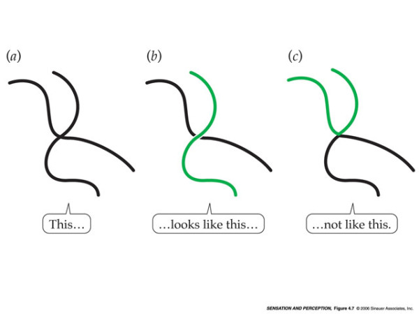
Continuation: we prefer to spot a single continuous figure (a line, path, curve) rather than separate lines.
Closure: Our brains don’t like unfinished business, so we tend to see closed shapes even if the object is incomplete or the element is not fully closed. This principle is often used in logos:
Proximity makes us create to create a group association between the closely arranged elements. When individual elements look similar, we tend to perceive them as a whole:
Figure/Ground principle makes us spot and separate objects from the surrounding background. We can see the foreground and the background as two different planes of focus at the same time. The example everyone knows is this picture of a two faces/vase:
The lack of Symmetry and Order is what makes users abandon certain websites and applications. The layout should not create a sense of disorder or imbalance as otherwise the user will mindlessly focus on locating the missing elements or trying to fill in the imbalance gap, rather than paying attention to your message or instructions.
Your design should radiate harmony and offer a good balance of symmetry, especially at the key screens like payment forms, landing pages and so on.
Remember, our brainpower is limited after all.
How To Make Your Product Even More Intuitive
Ever heard of the Hick’s Law? In short it states – people need more time to make a decision when the number of alternatives increases.
Making a choice between two things is hard. Making a choice between twenty alternatives is even harder.
Okay, so less is more when it comes to efficient usability, conversion and higher ROI? Well, it’s not that simple.
Will you buy from an e-store accepting only one type of credit cards e.g. Visa? Or from an online T-shirt store having one size for all clothes? Nope.
But when you offer too many options, another problem rolls out – the choice paralysis.
The problem of choice paralysis was addresses by the scientist from Columbia and Stanford University. As part of their research, they’ve conducted the “jam experiment”.
Researches set up two displays featuring a collection of exotic jams. Each customer, who came to sample the product, got a dollar-off discount for a jar. In the first case, there were 6 varieties of jams available. In the second – 24.
What were the top findings?
Out of 242 customers who passed the bigger selection display, 60% actually stopped to sample the jam. In contrast, only 40% of the 260 customers who passed the limited-selection display stopped.
Yet, almost 30% of consumers who stopped at the limited display subsequently bought a jar of jam, compared to only 3% of the consumers in the extensive-choice condition.
Here’s how you can apply the principles of Hick’s law and decision paralysis to web design:
- Curate content into appropriate categories. Don’t puzzle the user with multiple choices immediately. Squeeze the overall choice into bite-sized chunks.
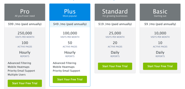
- Prompt the right choice e.g. by highlighting the most popular payment plan or making the sign up button more prominent compared to “learn more” link.
- Keep only the essential elements in your navigation. Break a list of 9 places to go into three branches with further sub-branches. For homepages/landing pages you may even want to reduce it to the essential minimum e.g. login/sign up/learn more/prices.
- Power up your website with effective search, but don’t offer multiple complicated filter options immediately. If you want your customers to discover the app’s full functionality themselves, let them do it! Curiosity often drives most decisions in your lives.
The Most Important Rule of Web Design
There are a lot more rules, laws and best practices that can help you build better designs e.g. Fitt’s Law, the Rule of Thirds and The Golden Ratio and more.
Yet, there’s also one supreme rule to guide them all.
Ready for it?
Don’t Listen to Your Users.
Yes, you’ve read it right – do not listen to the users, as they don’t know what kind of experience they actually want.
Instead, watch closely what they do.
The secret to creating an efficient product UX and UI is closely observing the users as they attempt to perform a task with a certain interface. As Jakob Nielsen points out, the whole process boils down to three simple steps:
- Observe what users actually do.
- Do not believe what they say they do.
- Definitely don’t believe what people predict they may do in the future.
Here’s a great story from Gillian Morris perfectly illustrating this point based on her personal product experience. In short – completely changing the app design and UI, which users adored, resulted into a few frustrated emails….and a major growth spike!
Simplicity and satisfaction of our common physiological bias make designs appear intuitive (or not). There’s no voodoo magic involved – just some common laws of how we tend to perceive and render information.
You now know what are schemas and how you should take advantage of those in your designs; the common best practices and some juicy laws and mental principles that facilitate in creating a better, more attractive and usable product design.
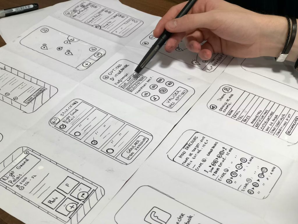
And if you need help with creating an efficient wireframe for your new product or tweaking the old one for higher conversions, don’t be shy to reach out to us!


